How To Make Low Poly Look Good
![]()
Low poly is beautiful. But it wasn’t always beautiful.
Back in the 90s when 3D games were just coming out, it certainly was low poly, and it certainly was not beautiful.. Apart from the nostalgia
But let’s face it, it was not very pretty to look at. Yet, today we are seeing a lot of new content pop up in super low poly, low detail environments, and yet – it looks gorgeous.
Read on as we explore the world of low poly, how we can make it beautiful and why it looks beautiful when in the past, it looked quite awful.
Further down we will take a look at how I created the featured image for this post, step by step.
What is low poly?
Low poly is a wide expression, in fact, all games you play today, including the latest EA games with top graphics, all count as “low poly”. Why? Because they all use the minimal amount of polygons possible to define the shape of an object. We then apply normal maps, occlusion maps, textures, lighting tricks etc to make the object seem like it has a lot of detail.
In this article however, we will be focusing on the “flat shaded” unsmoothed, minimalistic look, which has gotten a lot of traction lately, especially within the indie gamedev scene.
What makes low poly look good?
It’s about embracing the simplicity of things. Think of life drawing (drawing naked people), skilled artists try to draw the model before them with the least amount of lines possible.
They try to embrace the simplicity of the human form, but choosing those few lines carefully, will bring out complexity and beauty most people miss when looking at the original subject.

This is true when making low poly objects as well. We want to simplify objects as much as possible, but not any further.
Everything should be made as simple as possible, but not simpler. – Albert Einstein
Back in the day, they didn’t have access to all the fancy tools we have today.
They only had so many polygons to work with. Practically no lighting, no normal maps. Everything had to be baked into the texture, which were limited to very low resolutions.
Some games managed to cheat a live shadow in which was a big WOW factor at the time.
What makes modern low poly art look so appealing is this low fidelity met with high fidelity. Let me explain.
We take a very simple geometry, and render it in super high resolution. Apply just a flat color as texture, but use a complex shader with specularity, refractions, etc. We then render these simple shapes with the latest technology in lighting. This will bring out an immense complexity, even though we are just using these simple shapes. We are mixing low fidelity with high fidelity, giving us a pleasant blend between the two.
Modeling
Down to the nit grit, the first step is to model you subject. This process is what will make or break the final result.
Silhouette

Silhouette.. Silhouette.. Silhouette..
Making sure that the shape of the object reads well is very important, from all angles, especially if you are making a game where the player can inspect the object from all angles.
Polygons per unit²
What do I mean by that? Well, think of polygons as a finite resource. The amount of polygons should reflect the objects a) Importance b) Size.
Take a look at the example below:

As we are dividing the objects polygons with each step, we can clearly see when it no longer looks like a sphere. And putting them side by side, it’s not a very cohesive image.
However, if we also reduce the objects size in correlation to the subdivisions, we are maintaining the same amount of polygons in relation to how much space the object takes up. See below.

If we give two objects the same amount of polygons, but one object is half the size of the other. We’ve given that smaller object a higher resolution than the bigger one in relation to its size.
This is a very powerful technique to utilize when working with low poly. If you create one tree, or rock, and duplicate it to place it out here and there but with different scales, chances are your image will end up looking messy.
If you are going to have small, medium and large sized trees. Make sure to create 3 different models with an appropriate amount of polygons for the objects size and importance. A good rule of thumb is, if you are halving the size, halve subdivision as well. This creates cohesion.
Of course, this might not be true for every scenario, but it is a good starting point, and can provide some insight if you are feeling stuck or if something doesn’t “feel right”.
We also want to make sure our models do not have smoothed normals, also known as “no shared vertices”. Make sure to apply this setting in your 3D modeling software, as in for example Unity, this can not be changed afterwards very easily.
Materials
I try to keep textures to a very minimum. In fact, I prefer to only use flat colors, and create the complexity with lighting. I find this gives me the cleanest, most interesting result.
However, sometimes it can be nice to introduce a subtle texture to break up the surface slightly.
Do make use of components such as specularity, refraction, scatter etc. Utilising these can definitely give you a nice, unique look.
Be very careful of saturation levels, I see a lot of low poly art, grass in particular, which have too much saturation. Make sure to get some specular in, this will ease off highlights to a more pleasant, desaturated tone. Saturation can be a strong way to guide the viewers eye, but be careful not to overdo it.
Now, let’s take a look at what happens when you ignore the things we’ve discussed so far.
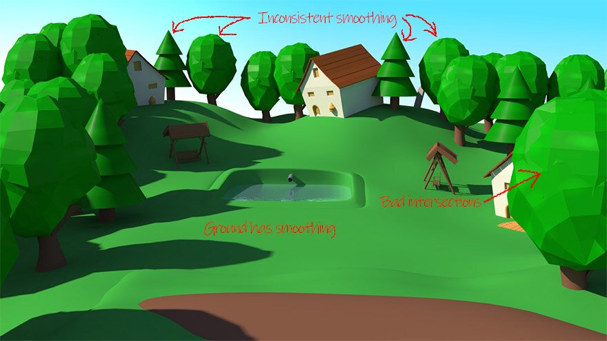
As you can see, this image is not very pleasing, let’s take a look at why. Huge inconsistencies in polygon size, some things are smoothed, others are not. Saturation level is very equal across the whole image, giving you no point of interest. Grass is too cool, a bit of warmth would have helped. It doesn’t look like a proper skydome was used – the color temperature seems the same in the sunlight and shade.
In contrast, let’s take a look at a similar scene with a more successful result:
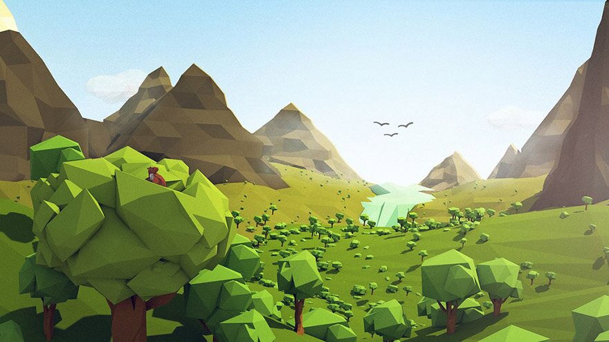
While the mountains in the back are not terrific, we certainly have a major improvement from the last image. Lighting is working much nicer, we have a nice depth in the image, drawing us in. The highlights are rolling off nicely on the trees.
Lighting
Lighting is THE most important part. All the rest is of course important as well. But, if you don’t get the lighting right, it will never look good.
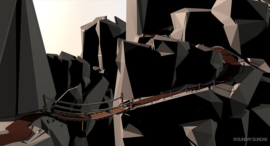
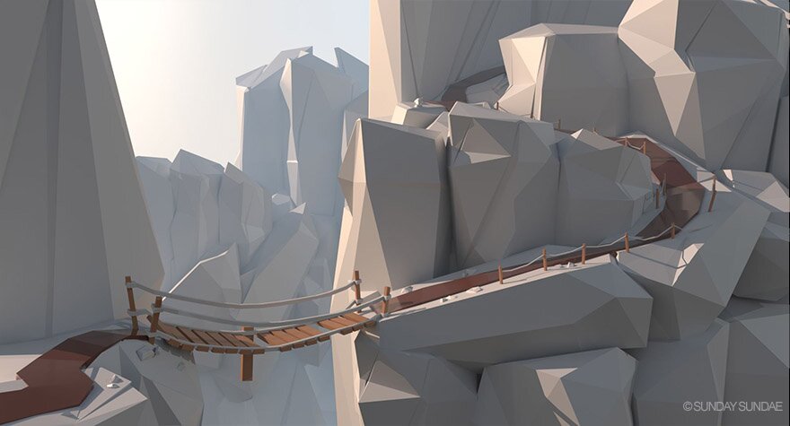
Let’s take a look at how I created the featured image for this post to get an understanding of how we can approach lighting.
Recreating the featured image
This was a quick and simple scene, certainly not perfect, but should work for our test
 |  |
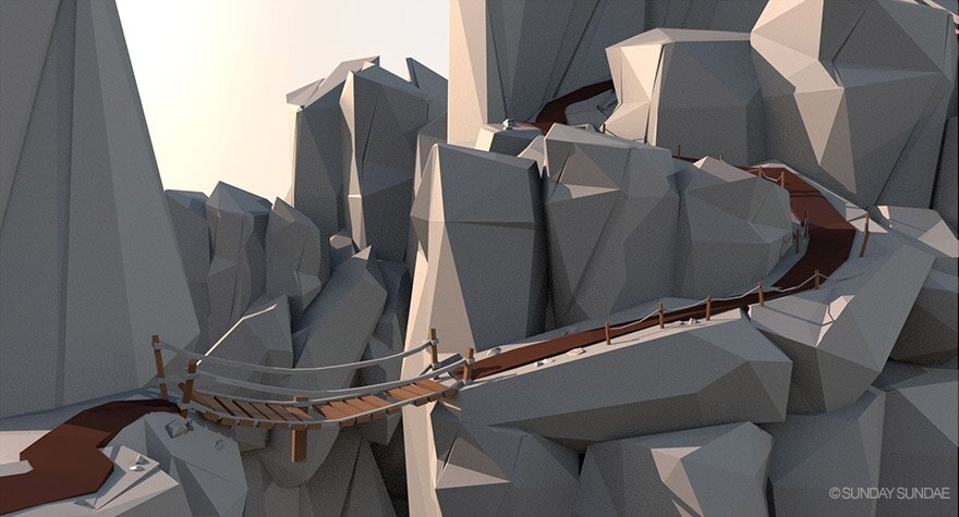
Starting off, let’s add a directional light. This will be representing our sun. I’ve chosen to have the sun to our left, giving some nice back light on the mountains.
While this could be a style on it’s own, it’s not quite what we are after. We have the direct light from the sun, but we don’t have the contribution from the sky.
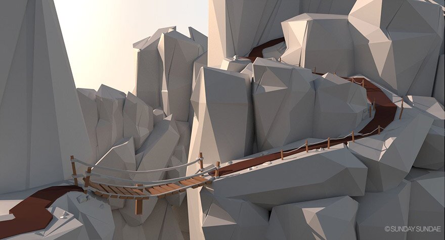
Let’s add a skydome to fill in the shadow areas. While you can just use a blue sphere, I highly recommend using a cubemap with a photographed sky, this can greatly help improve realism.
Much better, but we are still lacking some components. While we do have the light coming from the sky.
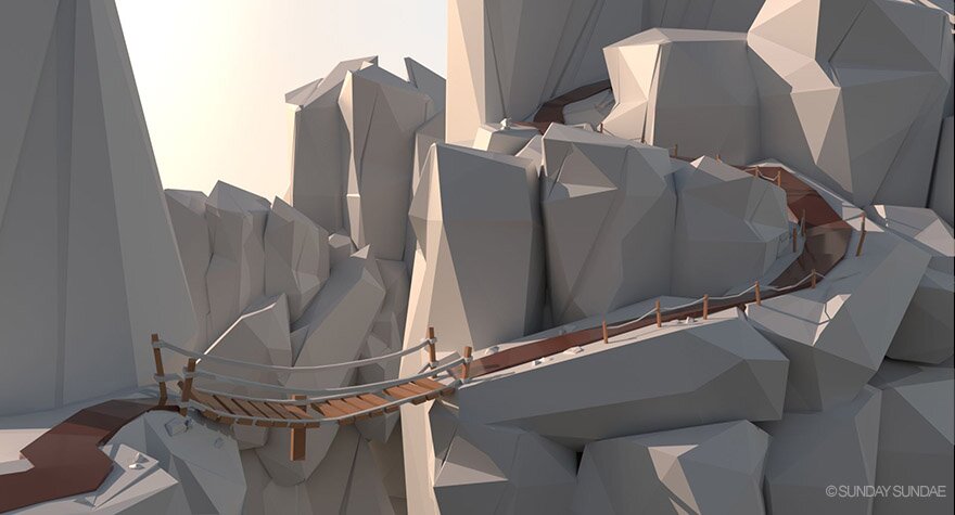
What we need to add now is indirect light. Right now, the light rays hit the surface, and then die. We need for them to bounce off the surface and keep illuminating. 2-3 bounces is generally enough for this purpose.
This is one of the most important steps, and quite easily forgotten. You can do this in Unreal and Unity, but it needs to be baked. As this is quite an expensive process.
That is a lot better, while subtle, it gives us a more expensive look. The indirect light helps with ironing out some of the darker, muddy areas seen in the previous picture – leaving us with a clean, fresh look.
Now only one thing left, the specular component.
While very subtle on the rocks, as I’ve set the specularity to be quite rough, rocks generally aren’t that shiny.
The major difference can be seen on the pathway. I decided to make the path quite shiny, it was looking a little flat in previous versions.
I am happy with this, let’s move on to Post Processing.
Post Processing
We’ve set the lighting at this point, but there are many tricks we can apply afterwards to improve our result.
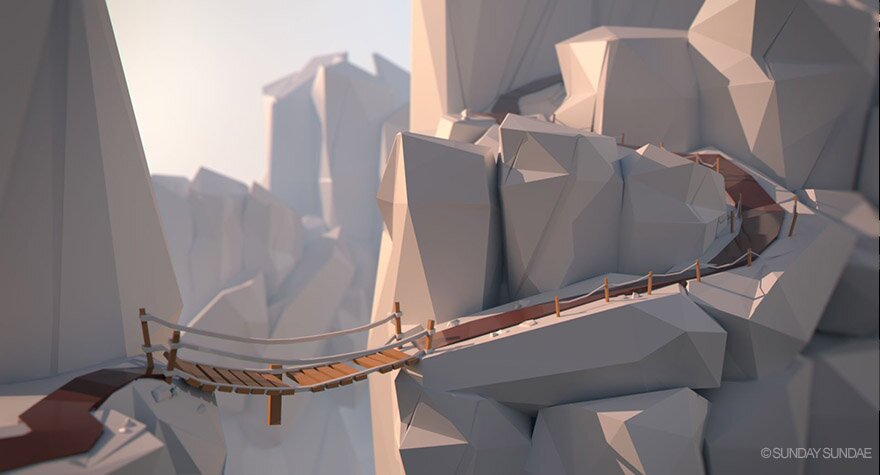
Depth haze
The first thing, especially in this image, is depth queuing. We can see the bridge, but it’s not quite as readable as we would like.
What can really help here is to add some depth haze to separate the foreground from the background.
This is where you can also go a bit crazy for different moods. We can crank it up a lot more to have a bit more of a cloudy, dangerous feel, as if we are really high up. Feel free to play with the color of the haze as well.
 |  |
I will go with the less extreme version, but the option is definitely there for you to play around with.
Color correction
This is where you can let your imagination run wild. Color correcting the final image is a great way to set the mood and get the right “feel” to an image. And it’s ok to go crazy, as it’s very easy to just start over.

In this case, I’d like for it to be a bit more dynamic. I’m going to warm up the highlights and cool off the shade slightly and add some vignetting.
Be careful with the saturation, a lot of great low poly stuff gets ruined by cranking the saturation too much. Especially on grass, if it turns into a green neon light, try backing off on the saturation a bit, and consider adding a bit more specular. Specularity can help with ensuring that highlights roll of to a more pleasant desaturated range instead of that screamy bright color.
Depth of Field – Defocus
A lot of low poly artists like to add quite an extreme amount of defocus, this can help with realism. It also contributes to a miniature look, which can work really well with low poly.
Let’s try adding some defocus to our mountain pass:
And there you have it, this is the image you saw at the top
Wrap up
I’d like to mention a game coming out later this year (2018), called Lonely Mountains Downhill.
Made by Megagon Industries, two guys who also love low poly
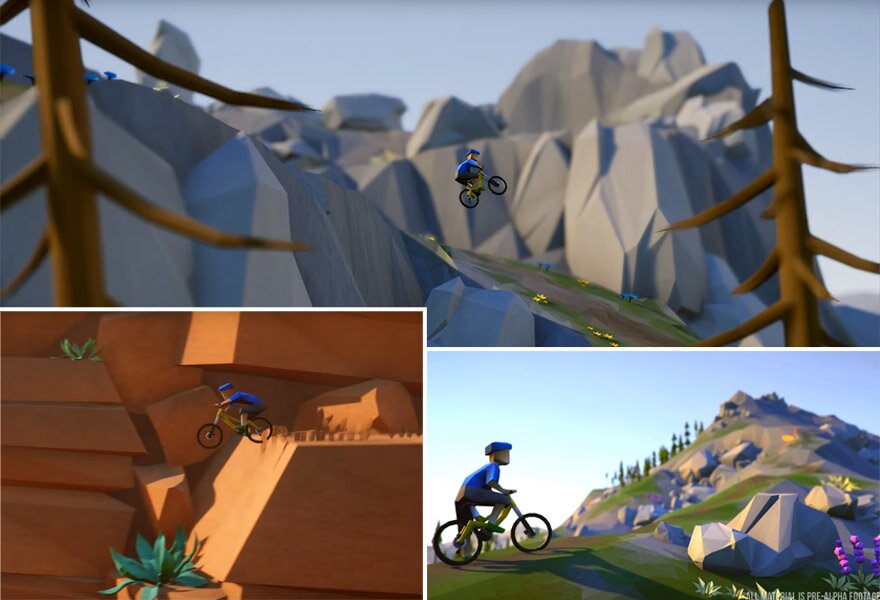 Lonely Mountains Downhill – Megagon Industries
Source: https://sundaysundae.co/how-to-make-low-poly-look-good/