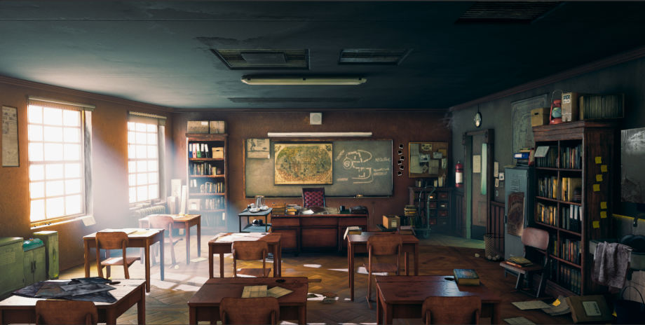
Making an Indiana Jones’ Classroom in Unity
Joey de Vries did a detailed breakdown of his Indy’s Classroom made with Unity‘s HDPR, Blender, ZBrush, and Substance Painter.
Introduction
Hi, my name is Joey de Vries, I’m from a small city called Leeuwarden in the Netherlands. When I was little I always had a big imagination. I loved to draw but somehow when I got older I drew less and less. I have always been a huge gamer, I used to play Mario on the first NES and now I play God of War on the Playstation 4. It’s amazing to see the evolution of games over all these years. And it’s weird that I never thought about making those worlds myself. It wasn’t until I had to use 3ds Max during my Bachelor of Communication and Multimedia Design when I realized how amazing it is to start with a cube and slowly build something up from the ground and see it come to life. After the teacher told us to try ZBrush, another world – the world of characters – opened to me. I discovered I couldn’t choose which way to go: do I become an environment artist or a character artist? So I decided to do both. Unfortunately, I’m not working in the game industry yet, but I’m working on my skills and making my portfolio industry-ready for a junior position as either an environment or a character artist.
Goals of The Project Indy’s Classroom
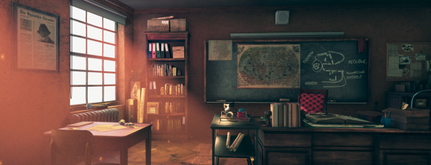
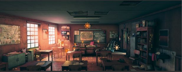
When I came across Andreas Rocha’s concept of a classroom, I was inspired to recreate it in 3D. I had several goals: making the concept come to life, improving my lighting skills, and learning how to plan and set everything up with the HDRP in Unity. I really wanted to make a lively and warm classroom that would tell its own story through little props and textures. The goal wasn’t to make a game-ready scene, but at the same time, I wanted to work clean and do my best to keep the models as low as they could be, without losing quality.

What’s So Interesting About HDRP?
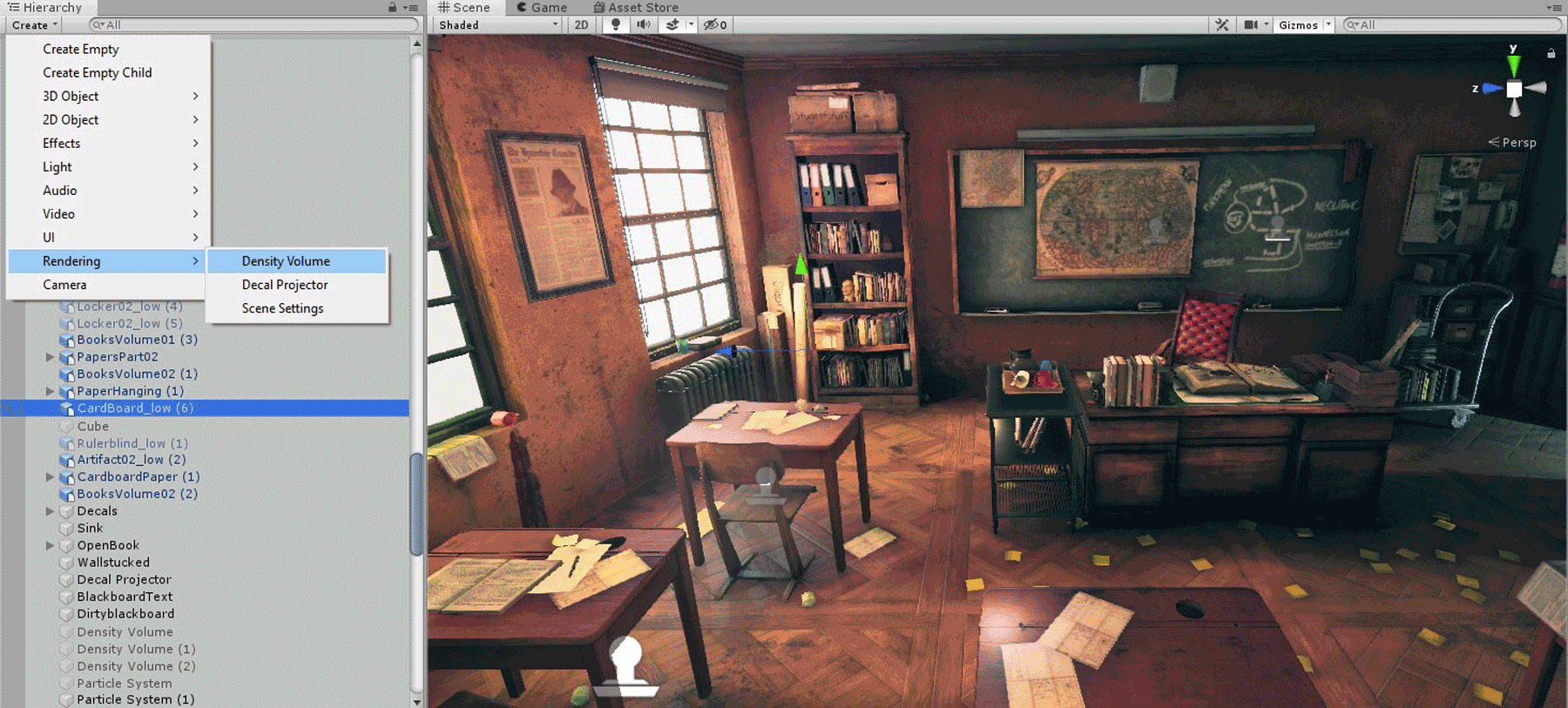
The awesome thing about HDRP is that it uses Physical Light Units (PLU). These units are based on lights that we use in the real world. PLUs react to objects as they would in real life. There isn’t a difference between opaque, transparent or volumetric materials, thus delivering a more coherent result. Because of the atmosphere and the use of light in Andreas’ piece, I thought this would be a nice challenge to try and take advantage of this new lighting system. Other things that I really wanted to play with were the use of Unity’s new HDRP Shader, volumetric lighting, density volumes, decal projector, and last but not least, its own integrated post-processing system. I’m not going to try and explain how you should set up your own project, but I can recommend this tutorial: EXTERIOR LIGHTING in HDRP, it shows exactly that. I am going to try and show you how I used HDRP for my Indy’s Classroom and hopefully I can keep you interested all the way to the end.
Blocking Things Out
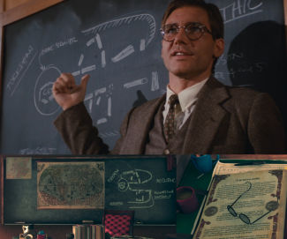
When I started this project I really wanted to make the environment match with Andreas Rocha’s Classroom concept art. But then I thought, maybe I should give it a twist and come up with a story of my own. That story became Indiana Jones’ classroom, but with the fundamentals of Rocha’s concept.
I began building a blockout in Blender. Once you put Blender’s project file into Unity, it’s really easy to work with it. Every time you save it in Blender the scene is being updated in Unity. Once I had the blockout looking like the concept, I went and played with the cameras in Unity: where do I put the camera to match the concept and what kind of field of view do I have to use? Then I quickly placed some lights just to see what they would do. Once I had everything the way I wanted, I started blocking out big props like the tables, chairs, and bookcases. The cool thing about environment art is that you have so many tasks you can do. Blocking things out, lighting, post-processing, modeling, UVing, and texturing props, etc. When you’re getting tired of one thing, you can just doodle around with something else.
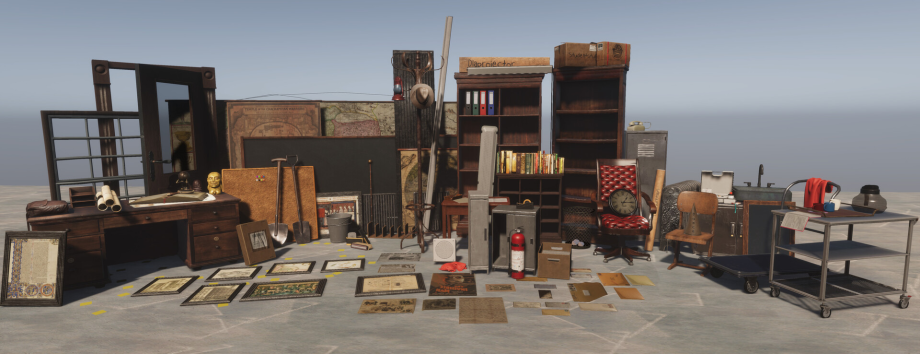
The World of Props
When I finished my blockout and camera placement, I started to look at Andreas’ concept to see what I should make first. My process went like this:
I first built all the primary props like the cupboards, blackboard, door, teacher’s desk and so on. During this stage, I began giving the props the 40s style. I saw it as practice because I wanted to get better at making props, therefore, I decided to make every prop myself including texturing in Substance Painter. Before I started modeling, I looked up a lot of references on Google to see how the objects were built to really dig into the details.

By building the primary props first and the props that you can re-use the most, you can quickly fill your scene to get a better picture, see if you’re going the right way and also if everything is scaled correctly. I always use a reference model that I put next to my props to see if everything is correctly scaled. When modeling the first props I started to realize that I wanted to make Andreas’ concept slightly different and because I’m a movie buff, I thought why not give it an Indiana Jones theme.
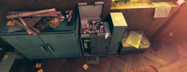
The next phase is building all the secondary props. The secondary props are props which help you to build the foundation of the story you want to tell. In this phase, I was thinking about the easter eggs I could make in order to connect it with the Indiana Jones theme.
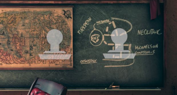
Indiana Jones Props Research
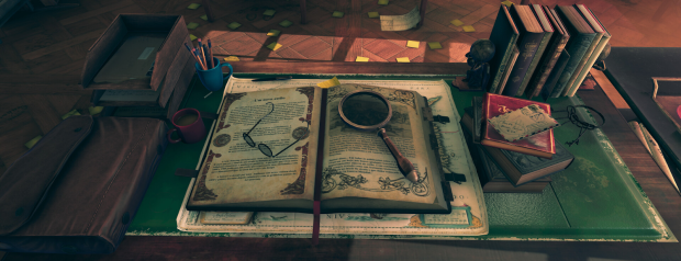
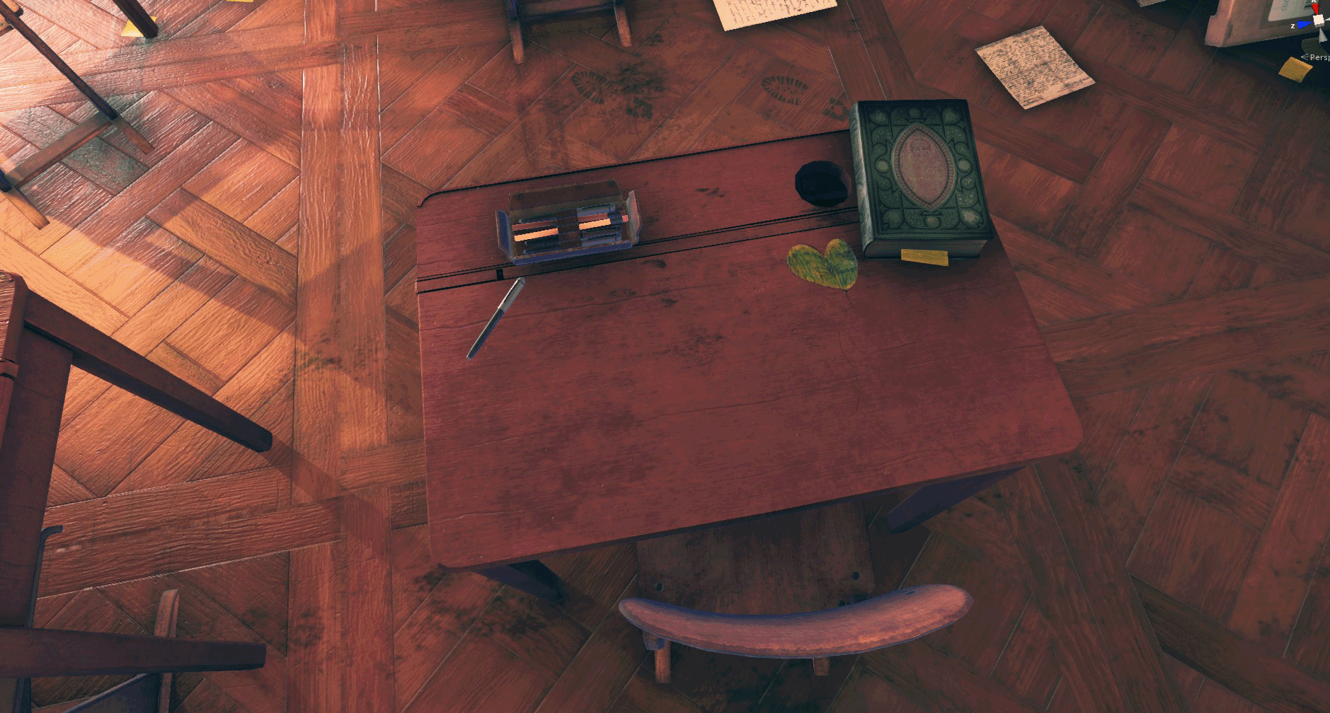
I wanted the reference to Indiana Jones to be very subtle and not like it was screaming: “it’s Indiana Jones!” The main reason I did that was that I thought it would be funny if someone would look at the scene and suddenly went like: “oh that’s his hat” or, “that drawing on the blackboard looks familiar” and so on. The props from the Indiana Jones universe are:
- Hat
- Fertility idol
- Blackboard drawing
- A big book on the desk
- The Sankara Stones
- Glasses
- Bag (I opted for a leather one)

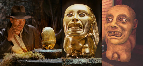
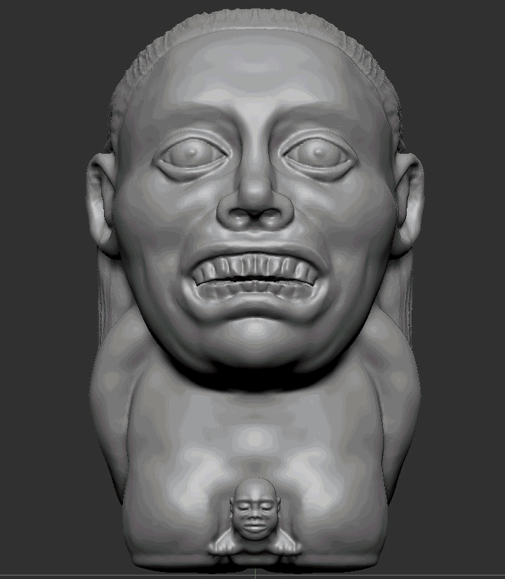
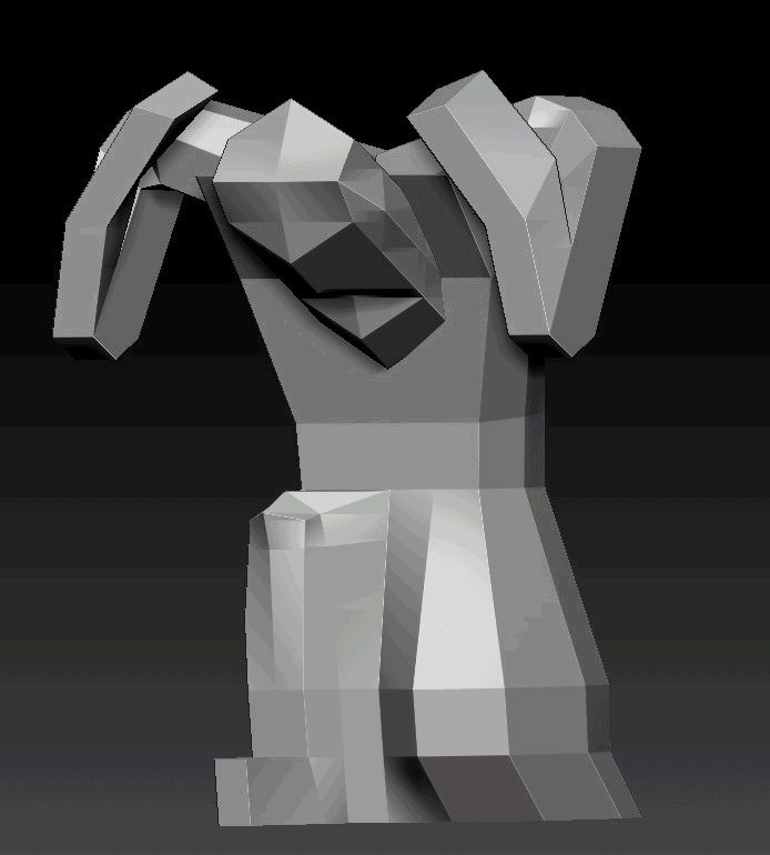
The hat, idol, bag, and Sankara Stones were sculpted in ZBrush. If you’re curious to learn how I sculpted some props in ZBrush, check out the videos I made:
Crafting the Idol in ZBrush
When I had all the references, I started with sculpting in ZBrush. Because the prop wasn’t going to be animated and I was just looking to make a nice scene, I cheated a little with the retopology and UVing of the artifact. I used decimate in ZBrush instead of doing a manual retopology, so I would have a low model and a high model. I used UV Master for the UVs. First, I painted the face red because that is what you want to protect. In that way, there isn’t going to be a seam going straight through the face. Then I checked the seam and used Unflatten to see if I would be happy with it. When I was done with ZBrush, I used Substance Painter to bake my low model and start painting. I did the same with the Atlas prop, but this time, I first blocked the body in Blender so I had a quick skeleton to build from.
Texturing
While I was painting and tweaking the materials in Substance Painter, I always had Andreas’ concept and many references on my second screen. I tried to make the material colors match with that of Andreas’ concept all the time. I still have to learn a lot when it comes to texture, but I know that one of the most important things when it comes to materials is the roughness. With roughness, you can replicate a metal, glass, plastic, wood as well as a dirty or clean surface and so on. When I look back at the props that I made for the classroom, I see that I still have miles to go. Because I wanted to make a lot of props and finish this environment within the time limit I gave myself, I didn’t create all the materials from scratch. Some of the wood and cardboard materials were bought on Gumroad to have some sort of a base I could work from and change the way I wanted. Here’re the links:
Wood materials:
Cardboard materials:
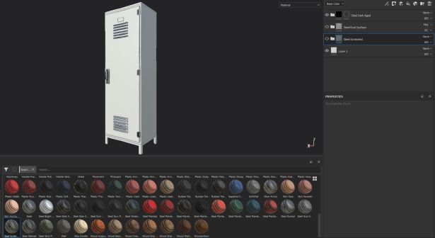
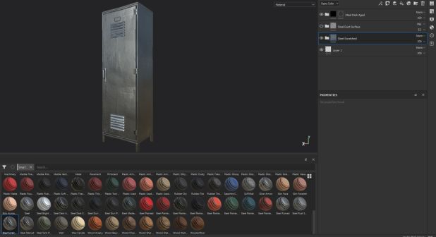
Another good source for textures is textures.com. Here I found textures for the walls, floor and a lot of decals. Substance Painter also has a lot of smart materials that will bring your props to life very fast. It also depends a lot on the model. With regard to my locker, for instance, I made sure it didn’t have too many straight lines because straight lines make a prop look fake really quick. For the locker, I used the smart material called ‘steel scratched’. I used this one because I didn’t want the locker to look brand new. This material will give you nice scratches on your surface.
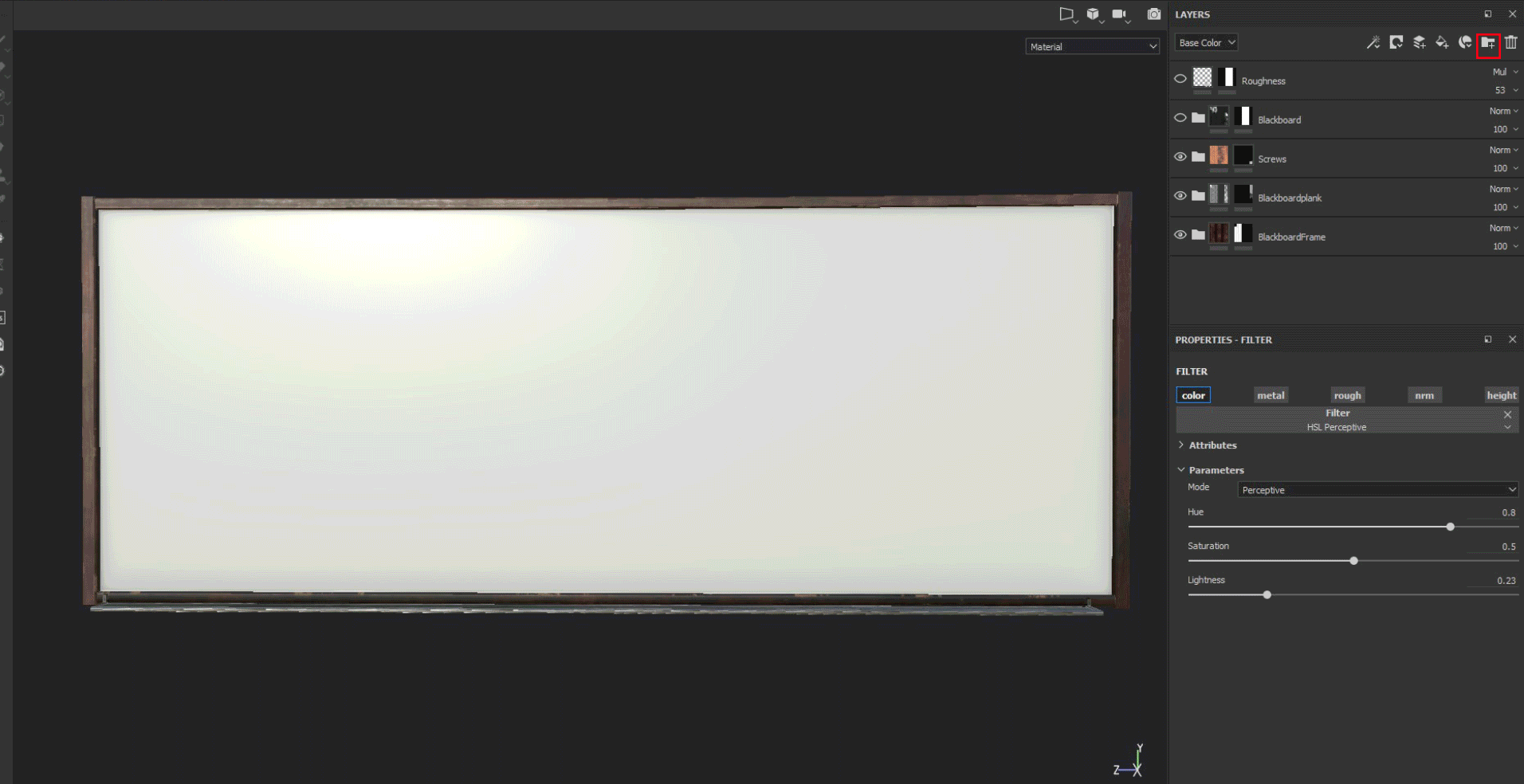
Another thing that will give you a quick result is using textures from Google or textures.com and editing these the way you want. I learned that by using the HSL perceptive you can change the light and color of the image. This way, I made my material for a dirty scratched blackboard really fast.
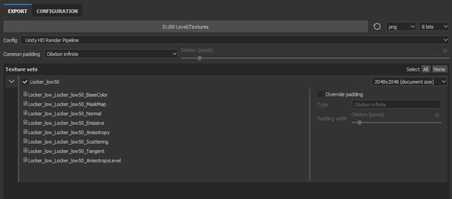
When you’re done in Substance Painter, you can export the textures with the config Unity HD Render Pipeline.
The Magic of Materials
Every time I finished a prop in Substance Painter, I went back to Unity to see how it looked in my scene and if it came close enough to Andreas’ concept. Back in Unity, you can make a new material. There’s a new shader, the HDRP shader, and this is where you can control a lot of the visuals of your prop. The fundamental textures of the HDRP shader are the base map, mask map, and the normal map. Besides those three, you have the bent normal map, coat mask, detail map, and the emission map.
A mask map is a combination of:
- Red Channel – Metallic ranging from 0 to 1
- Green Channel – Ambient Occlusion
- Blue Channel – Detail Map Mask
- Alpha Channel – Smoothness
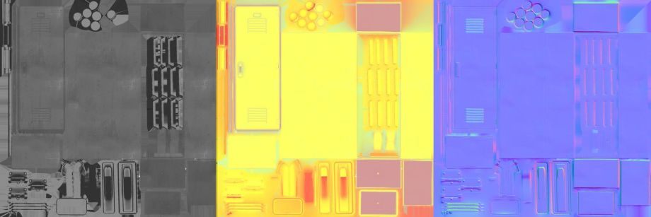
Locker Textures (Base map, Mask map, Normal map):
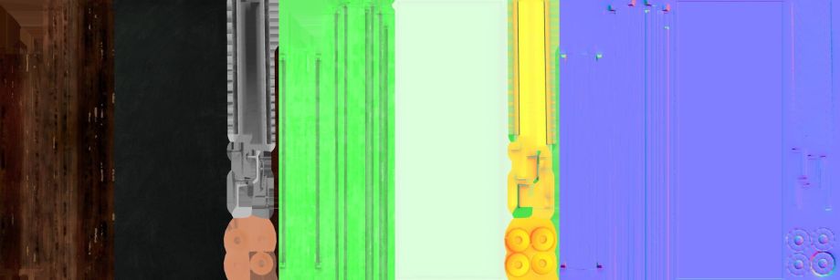
Blackboard Textures (Base map, Mask map, Normal map):
Comparison shaders (Unity 2018 / Unity 2019 HDRP):
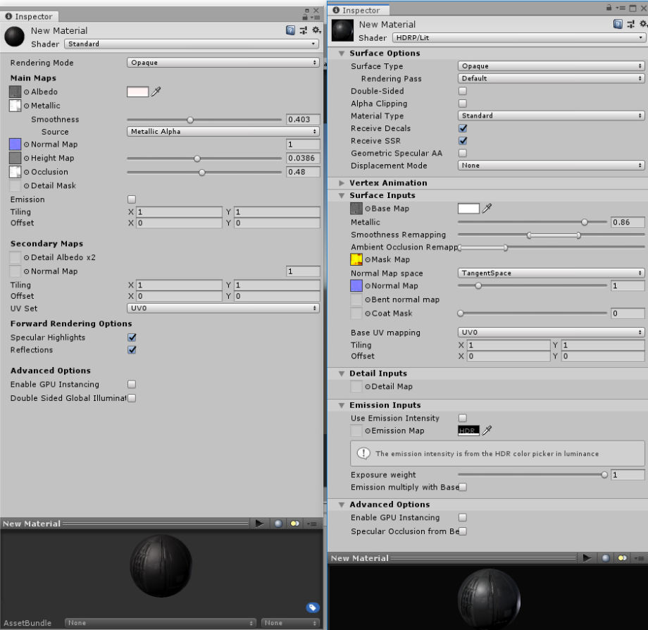
This new shader gives you more control over the texture than the previous one. It allows you to stay in Unity and iterate the texture to get a more satisfying result. When I wasn’t happy with the color of the prop or it didn’t come close to the concept, I could easily change it in Unity. Sometimes the prop looked too metallic or was not shiny enough. I could fix this with the Metallic parameter and make it less shiny with the Smoothness Remapping. This was also possible in Unity 2018, but I had the feeling that with HDRP you get a more satisfying and realistic look much quicker. If you want more information about the HDRP Lit shader, I would recommend this link: Information about the Lit Shader
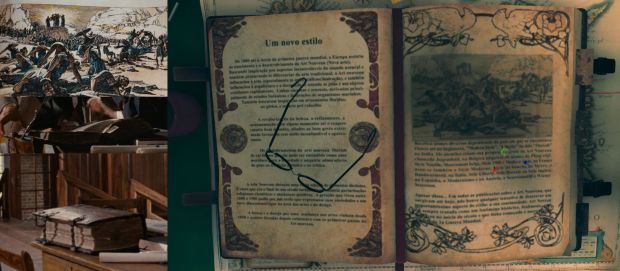
Books & More Books
I knew that for this environment, I would have to make a lot of books, but I just kept postponing it because it’s not the most enjoyable object to make, and therefore, it was probably was the trickiest part of this project. It’s not difficult to model, but you need to avoid making it repetitive, while also thinking about not using too many materials to keep the draw calls at a minimum in Unity. In the end, I made 32 different textures for the books and I used Photoshop to make a 4k texture Atlas. It was probably a bit of an overkill, but I didn’t want to lose any image quality. I also tried to think about what kind of books Indiana Jones would read and came up with historical books.
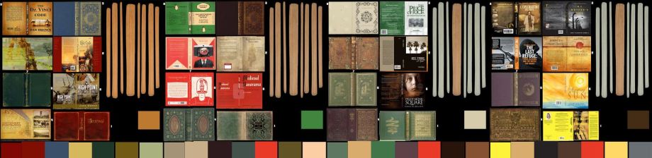
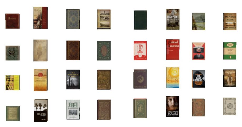
When I look at other 80.lv articles, I know that my way wasn’t the most efficient one, but it got the job done. Once I created all my books, I made volumes in Blender and grouped them. This way, I didn’t have to place them each by hand. I also wanted the books to have a bit of a normal map, so I placed the atlas in ‘Bitmap to Material’ to make some normal maps. This way the letters on the cover had some depth.
Storytelling
I didn’t want to stray too far from the original concept. This made it sometimes difficult to see what kind of stories I could and wanted to tell. Because I wanted to make all the props myself and give the concept a twist, I did a photobash to see what kind of stories I could tell without having to make all the props first. This also gave me a guideline want kind of props I had to make to tell those stories.
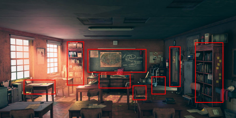
Finally, the tertiary props. Just like when you’re making a character, it’s in the tertiary shapes where all the details are showing and the concept comes to life. By combining tertiary props with decals, little stories are told.
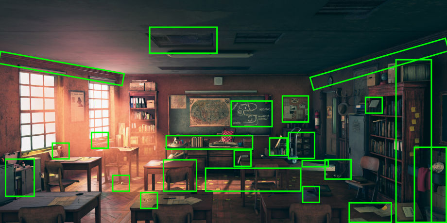
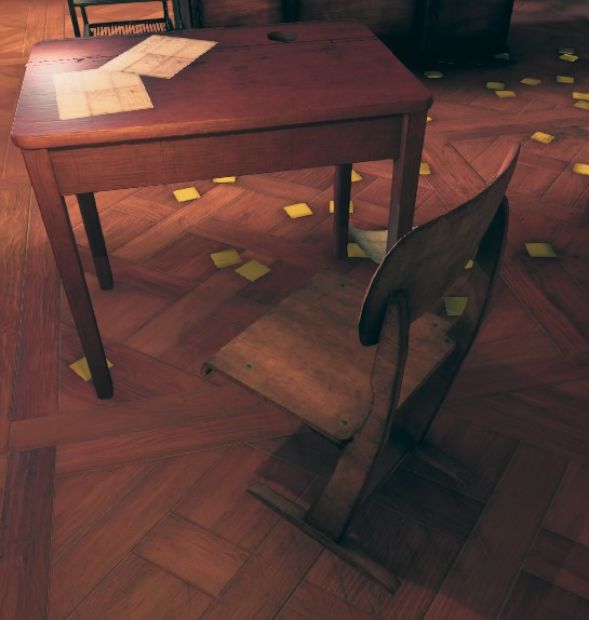
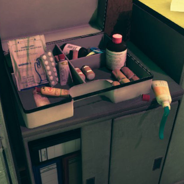
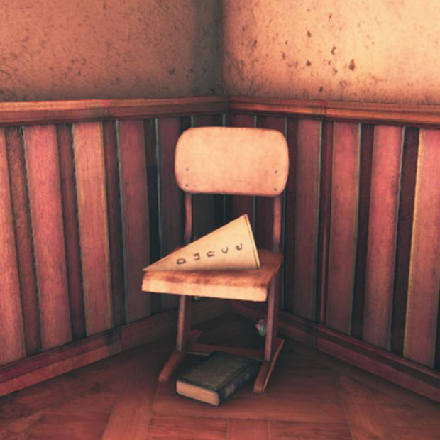
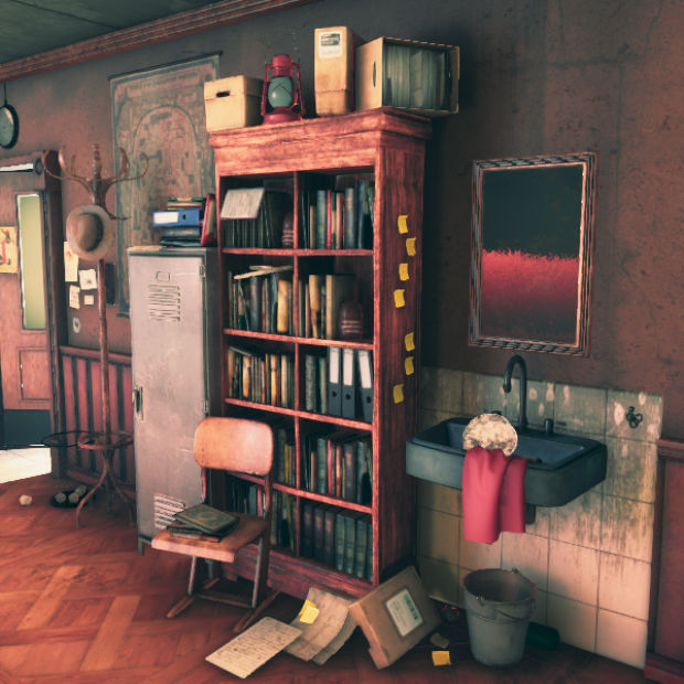
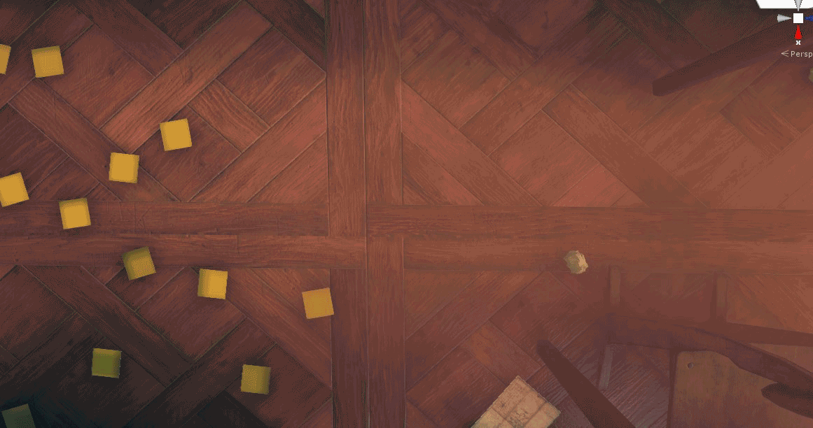
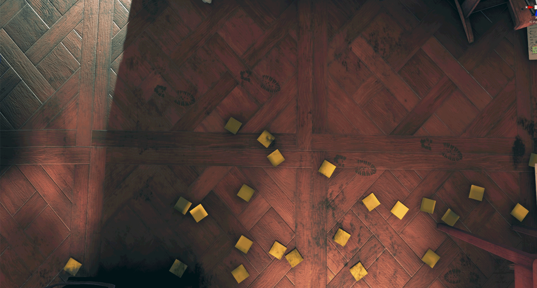
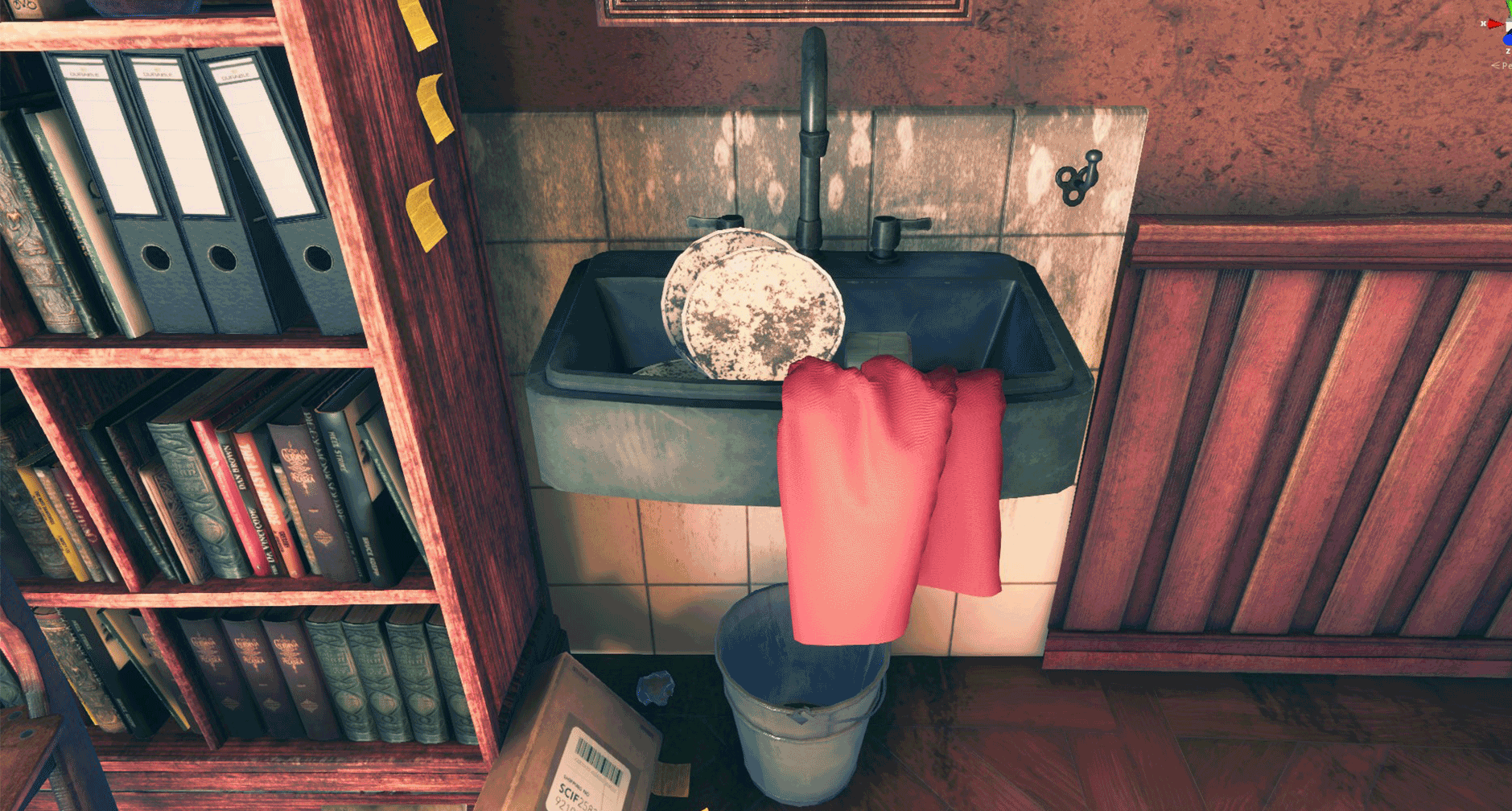
For example, a chair that is slightly skewed left scratches on the floor, a box with papers that fell down, a bucket beneath the sink which means the sink is leaking. In addition, I placed a dunce hat that children had to put on their heads when they were naughty and had to sit in the corner. Other elements include: using shoe print decals because the students have dirty shoes; post-its on the floor, because Indy accidentally dropped them; a first aid kit with an open tube the paste is falling out of, giving a hint that it has been used recently; a locker with an open door slightly showing what’s inside, making it a bit more interesting than totally closed. These are the little details that give an environment something extra like it’s alive. They give it a soul.

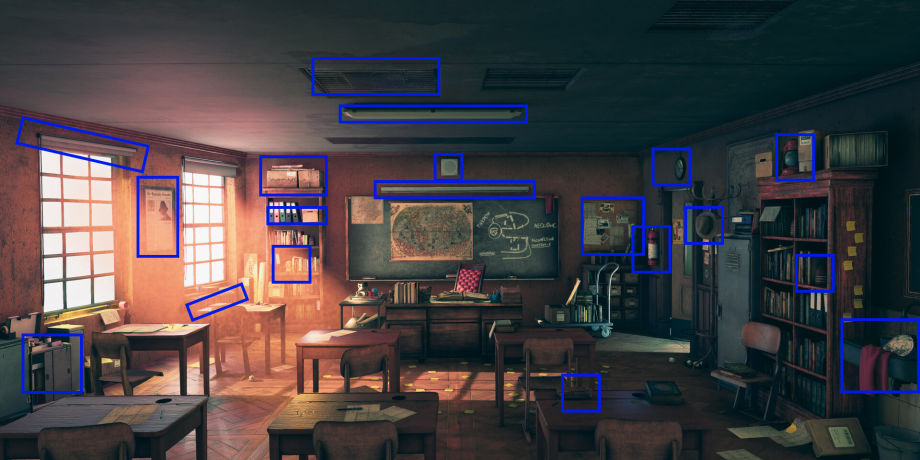
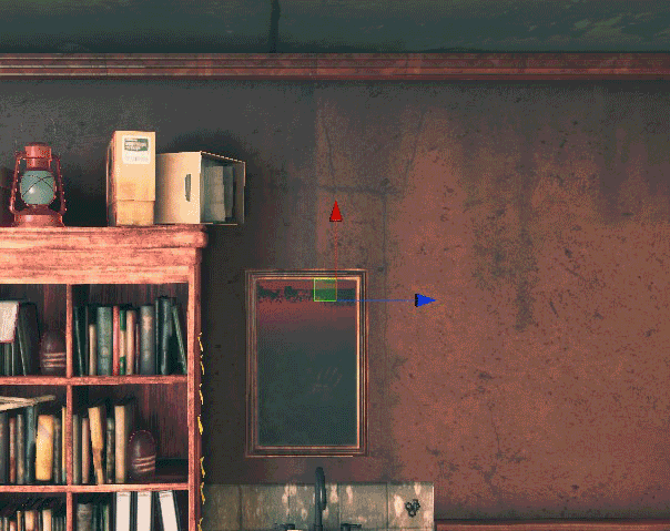
Use Decals to Give Your Environment Character
Besides using props to breathe some life in the classroom I also used a lot of decals. Textures.com has a great library of decals you can use. There are two ways of using decals in Unity.
Decal Projector:
Plane decal:
During my process of learning how to work with all these decals, I found out that most of the time it’s easier to work with a UVed plane and put the HDR/Decal shader on it with a decal texture. This is because you can quickly scale it and place it wherever you like. to be honest, I was sometimes a bit frustrated as I had to click precisely at the white dot to scale my decal with the Decal Projector, but I have to say that the Decal Projector is really useful when using several decals on the same spot. Like the blackboard, for instance: there are two decals, one is the writing and one is a dirt decal for an extra effect. With a plane decal, you have to be really precise, plus the two planes situated close to each other started to show some flickering. That’s why I opted for the Decal Projector.
To give you a small indication of how many decals I used, all the stamp symbols are decals. Keep in mind I also used a lot of plane decals.
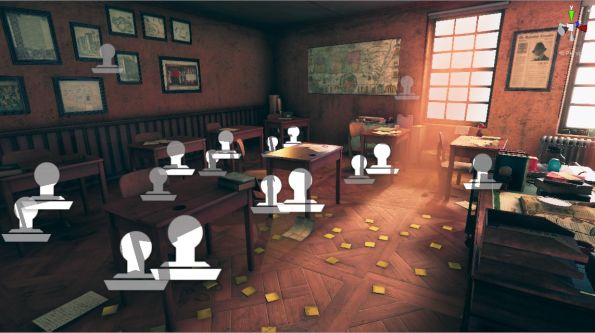
Here’re a few break-ups of the scene with/without decals:
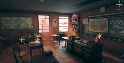
This little Light of Mine
I really wanted to translate the lighting and the mood from Andreas Rocha into my scene. I’m not a lighting expert and I don’t have a lot of knowledge about lighting so using HDRP setup to light my scene was quite a challenge. When I started this project, I didn’t know that lighting would be such a game-changing experience for me. In the beginning, I was trying to only use a directional light, and I thought if I set that right the rest would follow. Then I figured out that there was a lot more to it than a directional light and some point lights.
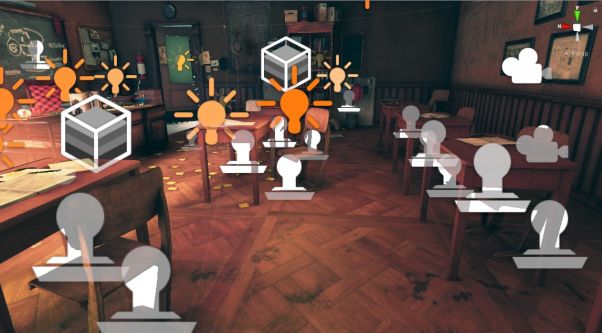
The lighting in the scene is built up around 1 directional light that’s the sun, 3 area lights (2 in front of the windows and one at the window of the door to simulate the lighting from the hallway), and 13 point lights. These point lights helped to get the atmosphere I wanted. 5 of them are baked, 2 mixed and 6 use real-time lighting. If wanted to make the scene game-ready, I should have used fewer point lights or tried to bake all the lights to get the same effect. But because I didn’t really want to make a game-ready environment, I gave myself a little more freedom to play with the lights.
The most difficult process during this project was probably the lighting. There’s so many things you have to think about, so many inputs you can change and if you tweak one thing everything changes. Progressive GPU helped me a lot by generating lights quickly because it uses your video card. In this way, you can generate your lighting and see in just a couple of minutes what your lighting is doing instead of waiting an hour before your lights are baked. Another thing that really helped me was keeping the concept next to my screen all the time, so I could see when it was too bright, or if I had to get some more shadows and so on. You just need to have a lot of patience to finally get the look you want.
Tweaking the lights to get something I like:

Point Lights
Because Andreas’ concept has quite a warm and orange feeling to it, I tried to use point lights with different saturations of orange to get that warm feeling in my scene. I had to be careful with the intensities of the lights because if it’s too high the props change their colors too much and you don’t want that.
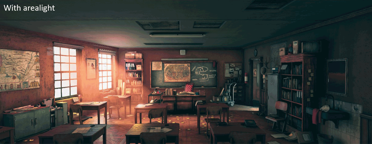
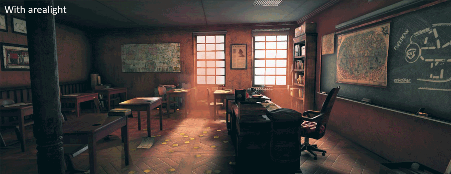
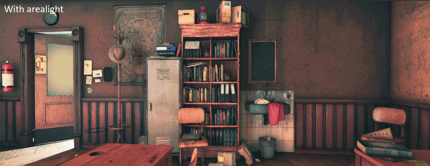
Area Light
Placing area lights at the windows had a nice effect on all the surfaces. These lights made sure that the surfaces obtained interesting reflections. As you can see in the picture, without area lights, you don’t see as much of the shine on the surfaces.
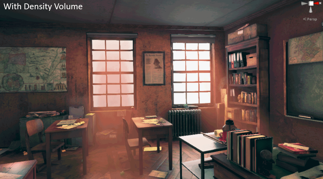
Volumetric
HDRP’s new volumetric lighting is awesome to work with and will get you a really nice result fast. It’s easy to set up and you can see how it gives that extra lighting and mood effect.

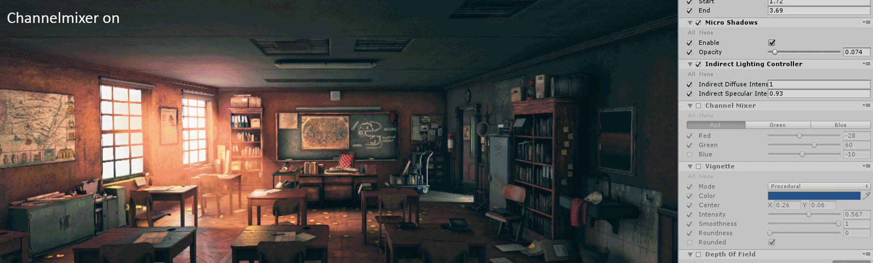
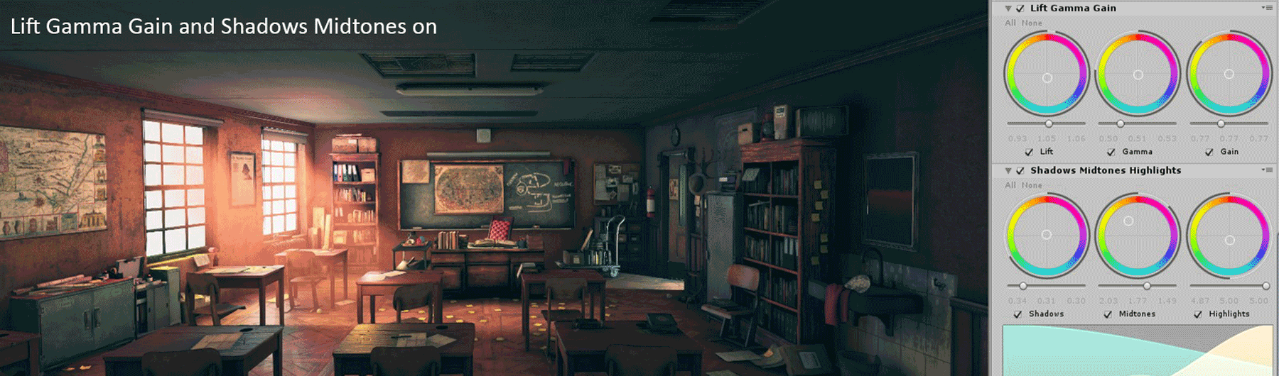
Post-Processing
Next thing that’s new in HDRP is the post-processing volume. In Unity 2018, I always installed the Post-Processing Stack from the Unity Asset Store, but in HDRP it’s already integrated. It’s amazing how much you can tweak to change the way the colors look and the feeling and mood of your environment.
The most important things I used for getting the mood and colors right:


Conclusion
I want to thank Andreas Rocha for his beautiful concept art that made me want to do this project in the first place and Maarten Hof for all the help and tips when I had questions about Unity.
The really hard nut to crack was translating the lighting and mood from Andreas Rocha’s concept into Unity. I’m no lighting expert and I still think the lighting in this scene is one of its weakest points, but nevertheless, I think I learned a small percentage about how the fundamentals of lighting work. I knew lighting was important, but I didn’t know it’s the soul of everything. Good lighting, as well as post-processing, makes an environment come to life. Without these two fundamentals, your environment is going to look shallow and dead.
Another thing I learned during this project is that planning is everything. Especially when you’re working from a concept. Before, I just started to model or sculpt. Now I have learned to analyze the concept first, to see what you will need and to think about how you can make things easier for yourself production-wise. It’s fun to just start, but it will come back at you at a later stage. Then you will think, “why didn’t I do this differently?”
On a mental note, I think the biggest challenge for artists is just to keep having fun with creating stuff you love. Try not to think about things like “I’m not good enough” or getting depressed by all the amazing work on ArtStation and thinking “I’m never going to be that good.” I used to think like that, but now it motivates me to become better and keep working. Just do the work and have fun with it!